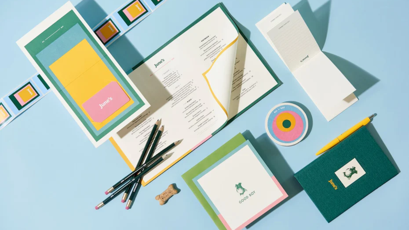
Use your network to find someone who is highly recommended
We first reached out to our network to see who was highly recommended and had a great track record of building brands, products and is a UI/UX Designer. This is where LinkedIn and Twitter are your best Relationship tools. We narrowed it down to three candidates and talked to all of them. We eventually went with Janet Valenzuela because she had time, was easy to work with and has been crushing it at Mandolin Live Streaming.
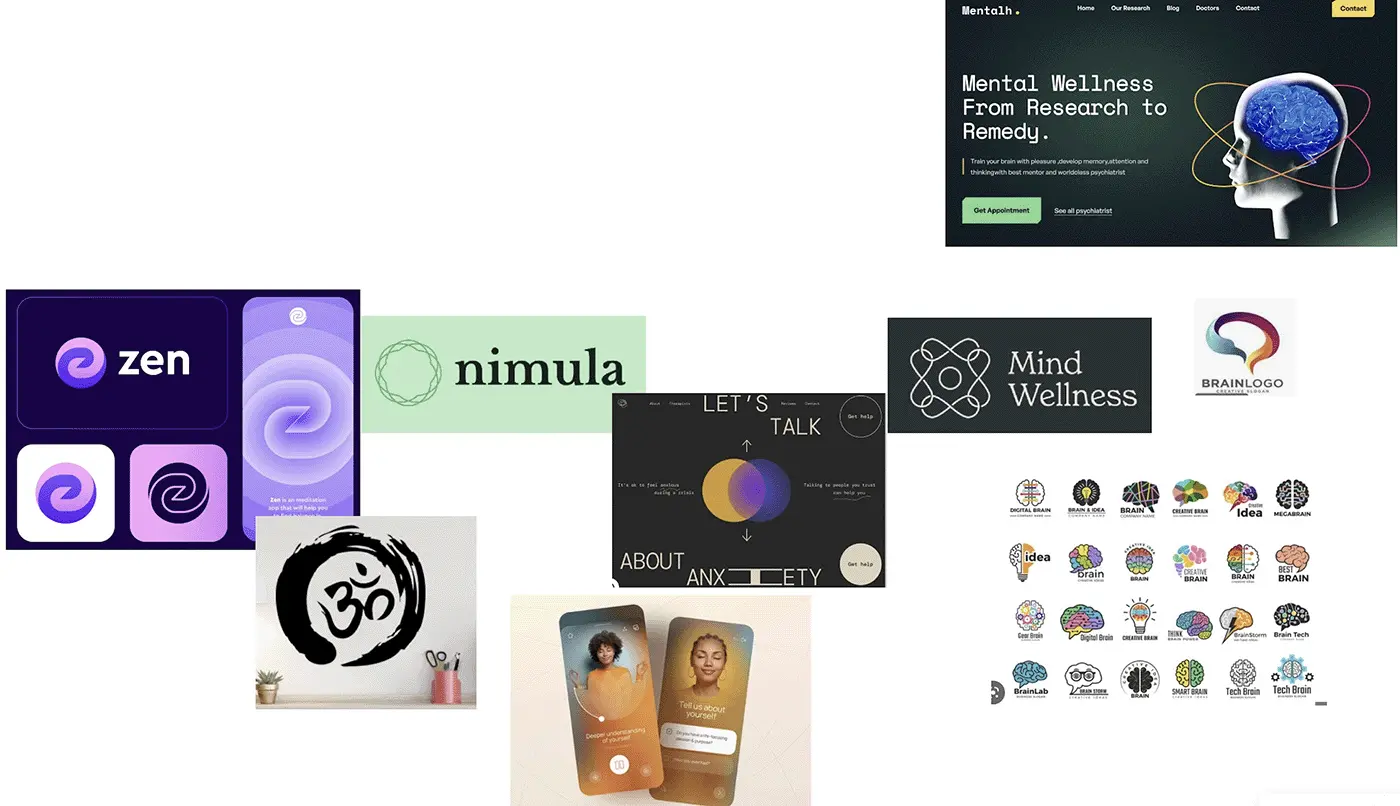
Our initial phone call with Janet was fantastic. We explained our mission and vision and she asked great questions. She also seemed passionate about what we are setting out to accomplish. One thing that really helped Janet is that we gave her a mood board of things we liked.
Picking a color palette
I love color. It brings so many emotions to me. Jackson Pollock is one of my favorite artists. However, I know this is where I need to stay in my lane and let the experts do their job. I am very color blind. The biggest recommendation I can make to the team is in the area of contrast. Too many people who do not understand what it is like to be color blind don’t understand the importance of color choice. Earth tones that barely have any contrast are horrible for folks like me. If you are picking light grey or green text on a white background, please reconsider these design decisions.
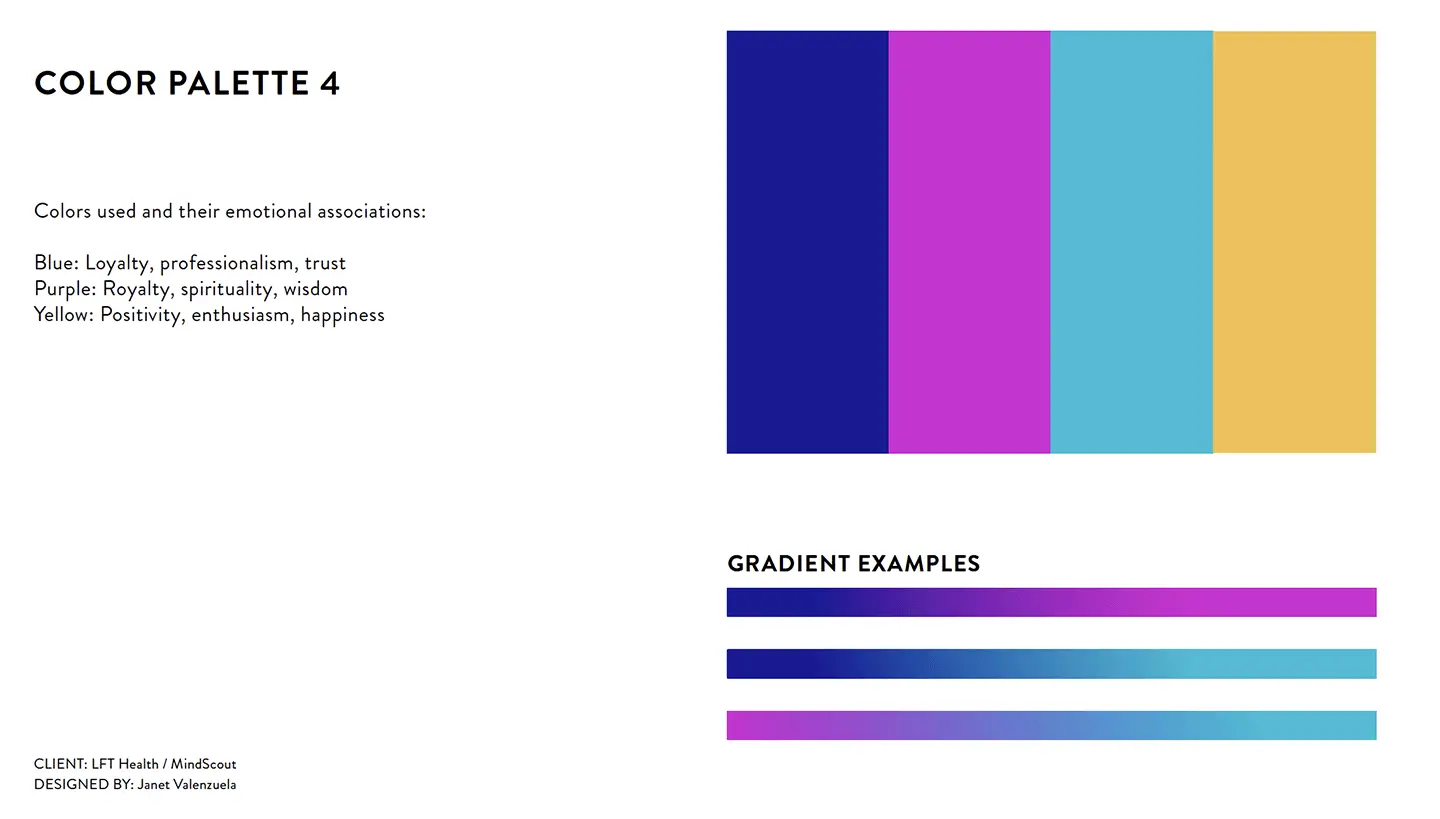
This is where our Founder and CEO, Jaime Bristow, really stepped up and helped the team. She already has an artistic background and a great eye for color. She placed all of the different palettes on a white board and got feedback from several like minded professionals. You can get an idea of what Jaime did below:
Let's look at typeface
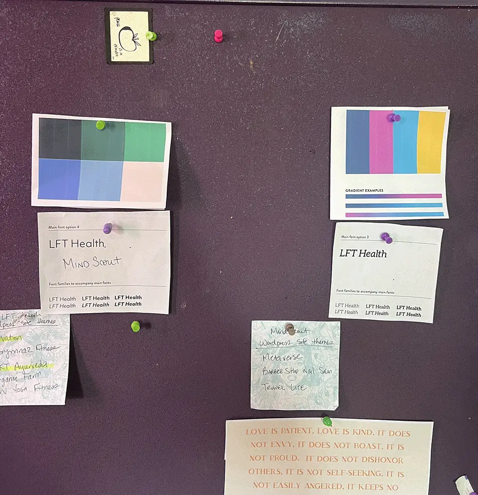
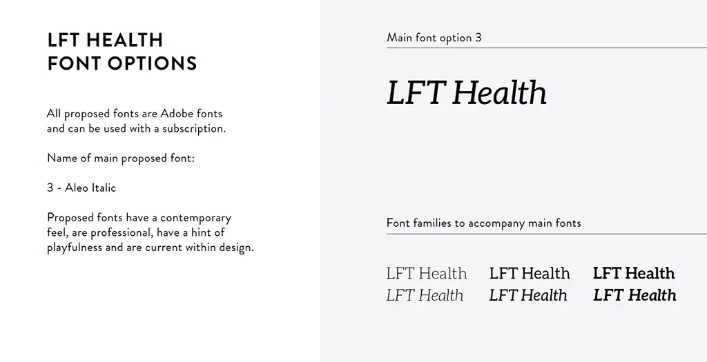
Fonts. There are so many to choose from. Google Fonts and Adobe Fonts are great places to find fonts. There are so many variables that go into picking a font, but in the end, it can be a very subjective decision and one based on personal preference. As a team, we wanted the font to be legible for LFT Health and a bit more contemporary for our first product MindScout. Again, we laid everything out and as a team discussed the pros and cons of each one.
Logos
Logos are usually what customers see first in digital product design. You need to know who your customer is and hopefully catch their attention quicker. Making a first impression is important. For MindScout, we were presented with three different options. We did an interesting process to get initial opinions from the team. Without saying a word, everyone wrote down in order their favorite without telling each other (i.e. secret voting). Surprisingly, everyone of the team had the same favorite logo! Lucky!


We unanimously picked the first option and everyone loved it. This inspiration was brain waves, testing and assessments. It has a contemporary feel and gives customers a hint at what the app does.
Now...We are ready to change the world
Branding wasn’t the first place we started when CEO Jaime Bristow approached me on leading up the technical effort and helping with the User Experience. She already had a problem to solve in the mental health community and a unique solution that I would have a positive impact on everyone’s mental health. Her insight into how the payment system works in healthcare is also extremely valuable. I also referred her to a great patent attorney so she could protect her idea, vision and mission.
I am honored to get to help in any way I can. Stay tuned.
